QUESTION: Dear Martin,
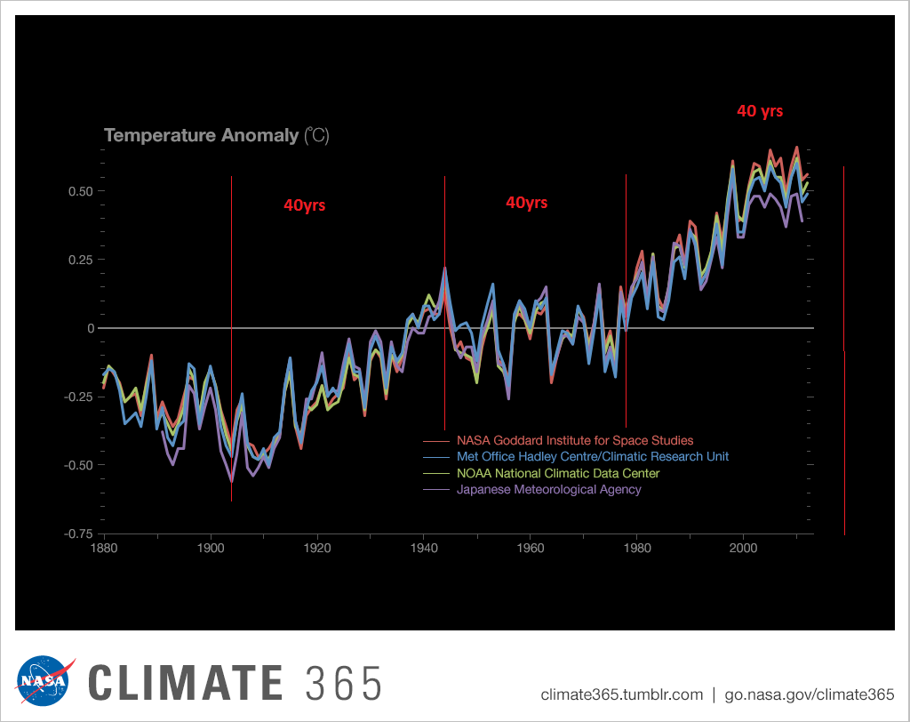
I was browsing through the website of NASA and came across a graph (see attachment).
It shows the temperature differences between 1880 and 2012. As far as I can see there seems to be a +/- 40-year cycle. I have edited it with the red vertical lines. The end of the current 40-year cycle should be around 2020, which, if I am not mistaken, coincides with a date you have mentioned previously in one of your blogs. This could mean that around that date a new 40-year cycle should start and temperatures should decline. What is your opinion on this?
Best regards,
SG
ANSWER: Yes, not bad. Look closely. The Japanese data seems to be the least messed with. The others have recalculated the data numerous times to get the biggest effect. Our model shows a 43-year cycle to be precise. That is driven by the energy output of the sun for it tests back into ancient times as well. The Japanese data is the least “politically correct” data whereas the US versions have an agenda behind them to justify raising taxes as if we can really change the climate of the entire planet. They get away with this because they confuse people with pollution and climate change. Hospital waste dumped in the sea does not change the climate but is disgusting and dangerous in spreading disease.
The energy output of the sun peaked in 2015 and has been crashing faster than anyone thought possible. The fascinating thing as you look at the chart and see the cycle. They do not. They forecast linearly whatever trend is in motion will last forever.


